

Metro
As designers and artists, we are always creating, editing and changing the world around us. We constantly and naturally set out to improve experiences. As we know it, mobile life consumes our daily life. “What if we could do this…” or “I wish the app would allow me to do that.” It’s only natural that we want to improve what we use. It’s so near and dear.
As a commuter using my local transit app, I was constantly changing the UI and the UX while on the go. I was a user, and I had feedback. I wanted to visualize an app that made me feel spirited and excited to commute. An app that was just a few taps away of every major action. Below is an exercise in the potential of what an infusion of intended spirit could actually do for both the UI and UX.
concept UI (Mobile)
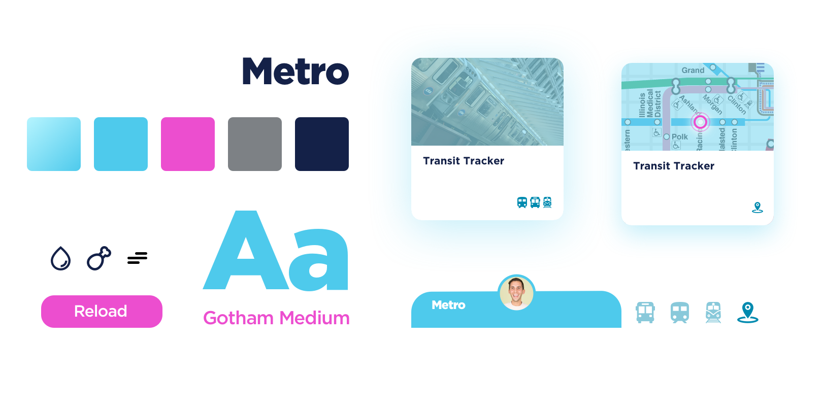
UI exploration cards, iconography, rounded shapes, color

Fly Menu with your transit options.

“Floating Cards” on the home screen.

Easily Reload and refresh cards

Current Default Screen with randomly placed information and details, inconsistent UI and overall confusing hierarchy.
Image Credit:
https://www.ventrachicago.com/